Customize Reports
Helping senior living companies build data reports to achieve their business goals.
Overview
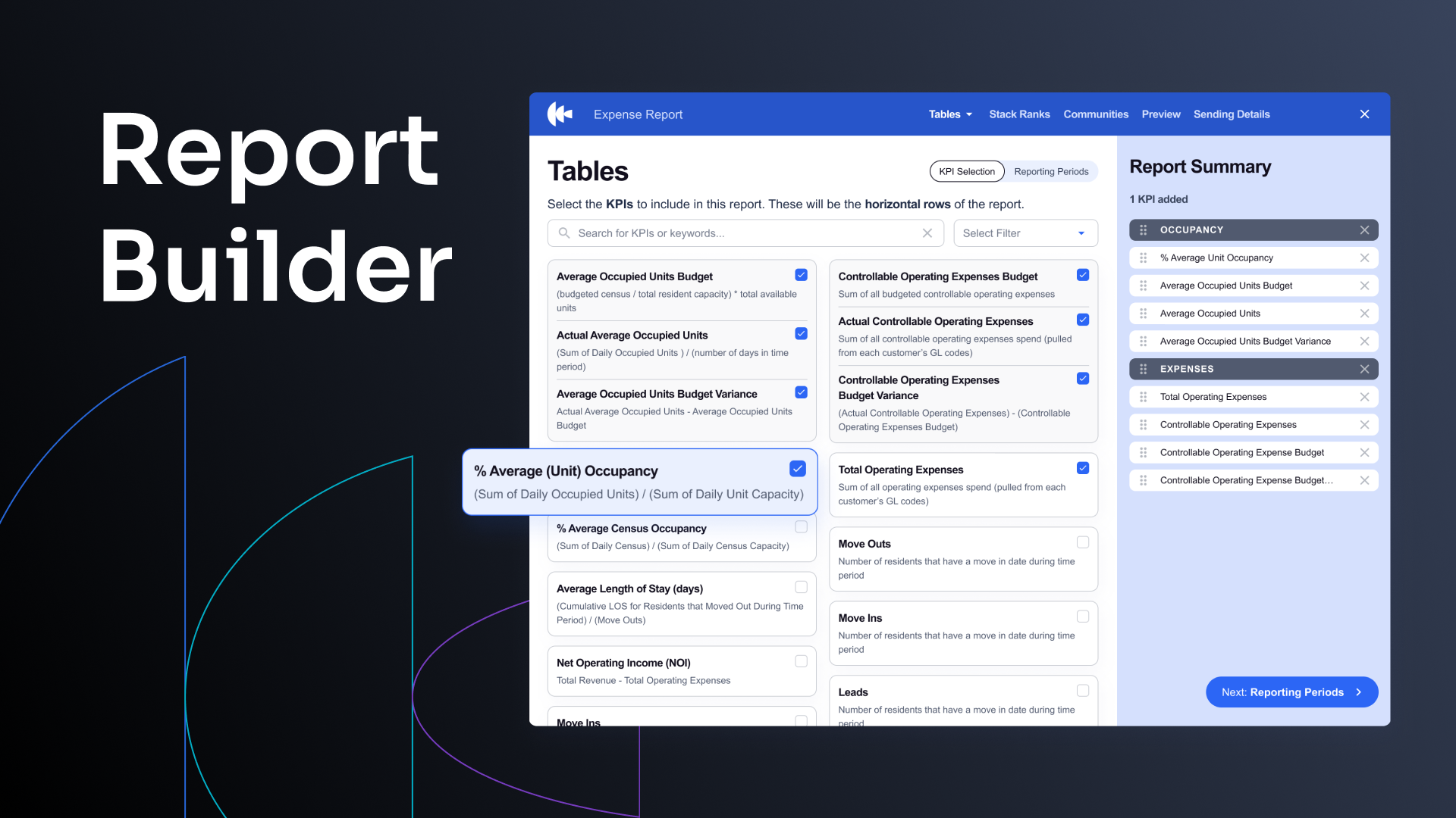
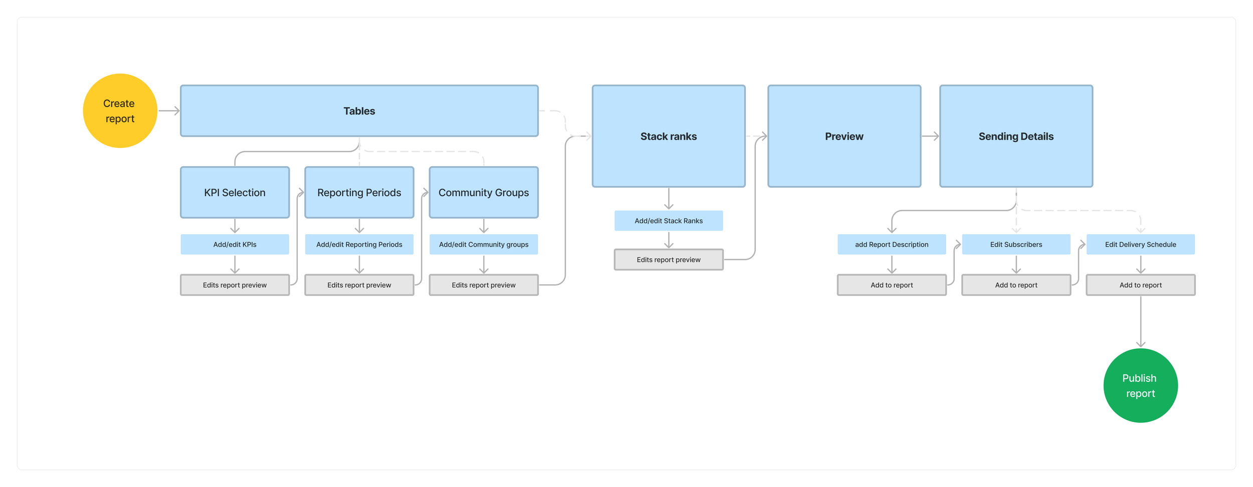
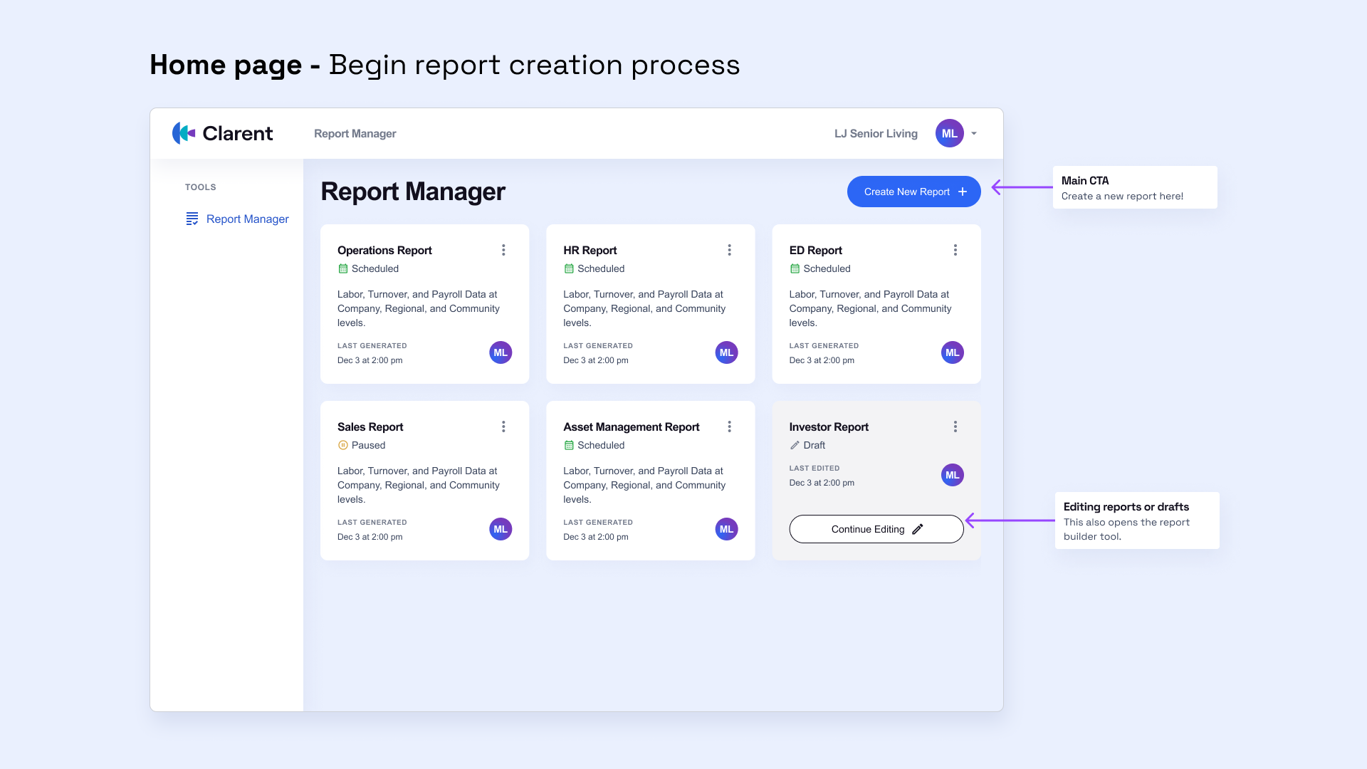
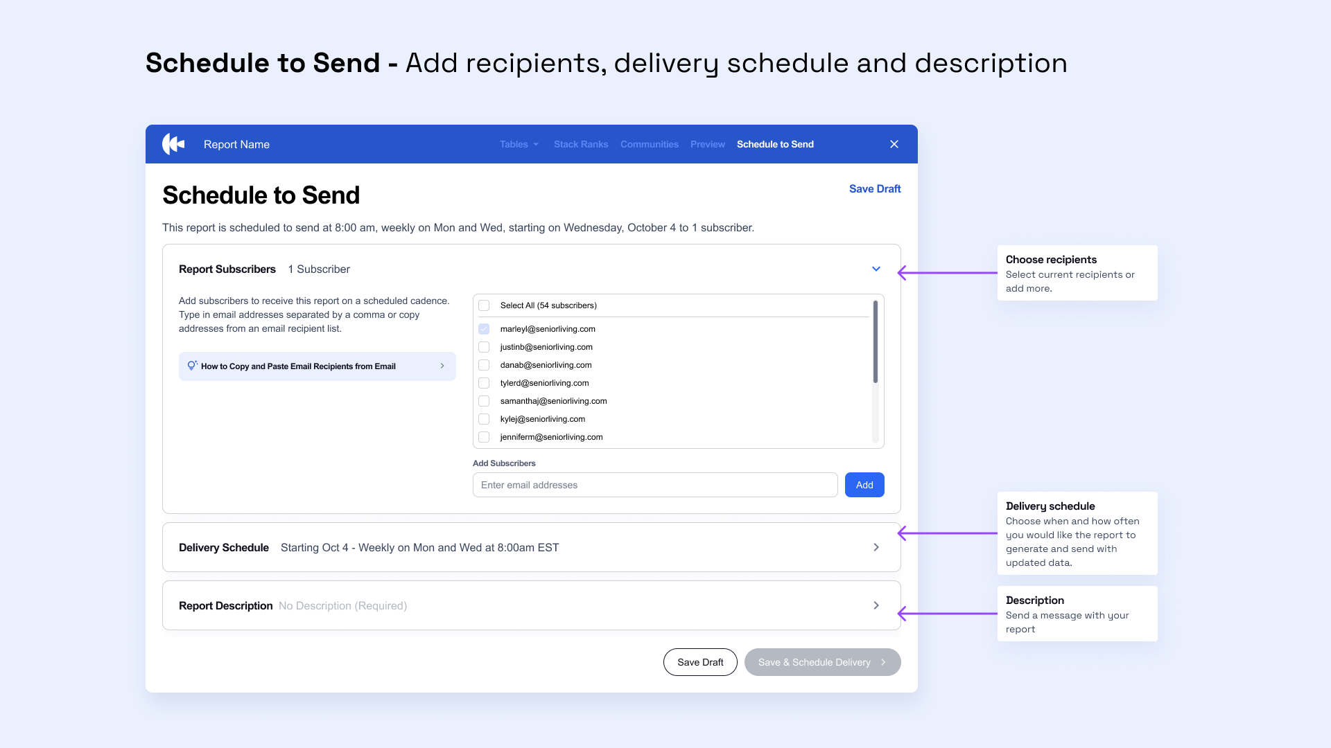
The Report Builder allows senior living companies to create, manage, and customize reports for scheduled distribution. Users can modify KPIs, reporting periods, stack ranks, and communities within reports to suit their unique business needs. The tool ensures customized reports are delivered to recipient’s inboxes on a scheduled cadence.
Role
Product Designer
Team
Design Lead, CTO, 3 Engineers, CSM, & 3 front-end developers
Timeline
Phase 1 Design - 2 weeks
Phase 2 Design - 2 weeks
Background
Clarent Mission
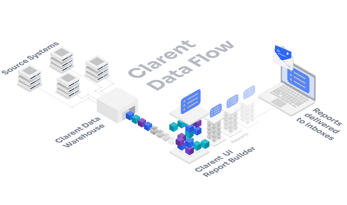
Clarent is a software platform that enables senior living owners & operators to see all their data in one place and make better decisions. To do this, we integrate with their Sales, Occupancy, Financial, Payroll, and Medical systems, and use it to produce a library of 100+ KPIs that users can make into reports.
Current Product
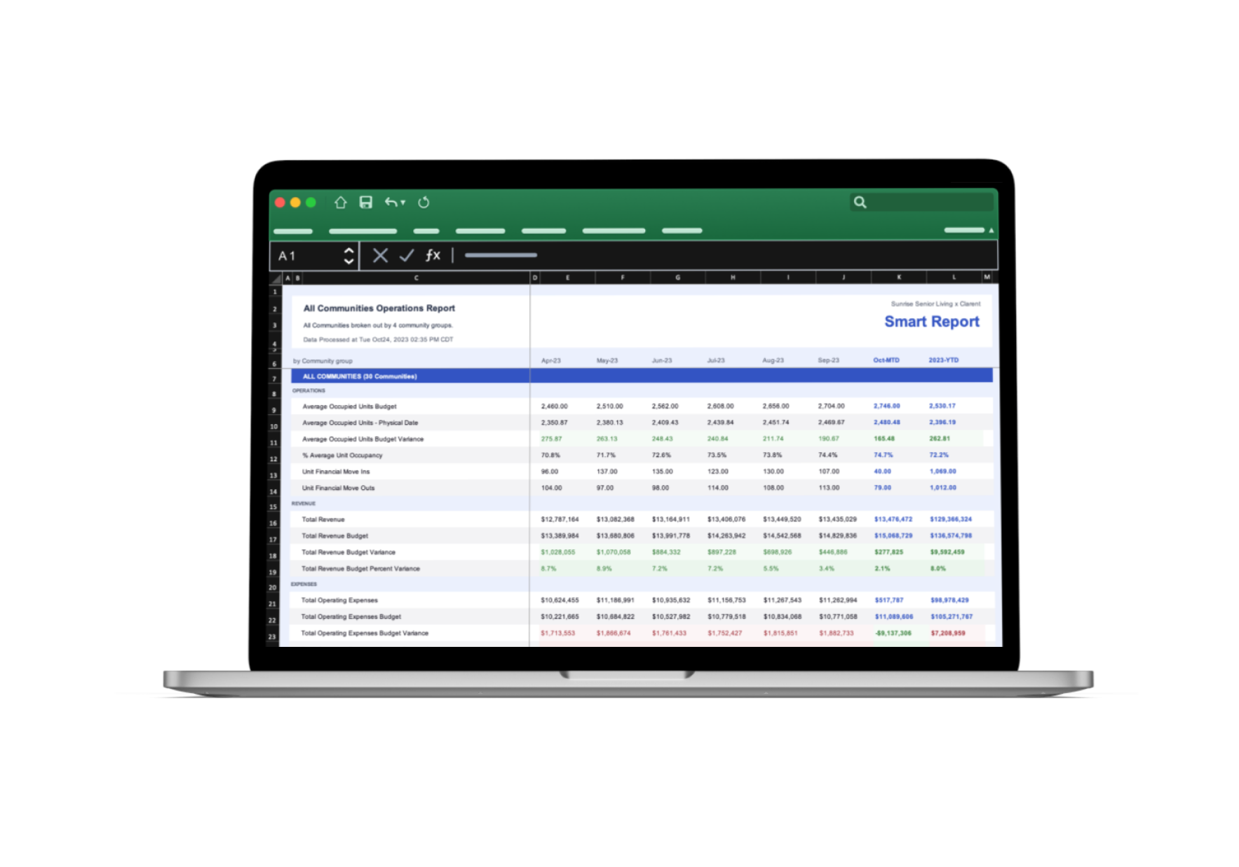
The current product output is called Smart Reports. They are departmental, “off-the-shelf,” Excel data reports delivered to users’ inboxes on a scheduled cadence. Right now, customers tell us which reports they would like (ex. HR, Operations, Exec), we hook their systems up, and then our engineers customize these reports manually to fit the user’s needs. This process takes a lot of engineering time that would be better spent on completing new integrations.
Problem Statement
How might we design a robust report builder tool that empowers users to customize and expand upon Smart Reports, allowing seamless editing of report-sending schedules and recipients? The challenge is to transition from bespoke, custom reports to a scalable, user-friendly product capable of accommodating diverse customization needs.
User Interviews
Research
We started by sending customers 4 “off the shelf” departmental reports that were manually built by our engineers. After using these reports for a few weeks, we gathered feedback through recorded customer interviews with our CSM. We asked them questions about how they use the reports and what they would like to change about them.
Findings
Customers like the overall format of the reports, but
Customers would like to be able to edit the content and order.
Customers want to be able to see what the report will look like before committing to sending it to others with data.
It often takes several rounds of iteration and collaboration between multiple people before the report is ready to send.
Solution
Empower users with the ability to customize, visualize, and refine reports using an intuitive web application, completely removing the engineering time required for report customization.
DECISION 1
What can users change?
We wanted to prevent analysis paralysis, but also give the user as much control as they need while building a report. Too many decisions may cause the user anxiety.
DECISION 2
Drag to Order
Being able to drag report components into the order they want them gave users a more physical sense of control. We also got feedback that it was fun for users.
DECISION 3
Preview Page
The “preview” lets users see what their reports will look like before it is generated with data. This is to give users a chance to check out the format before sending it out to recipients.
DECISION 4
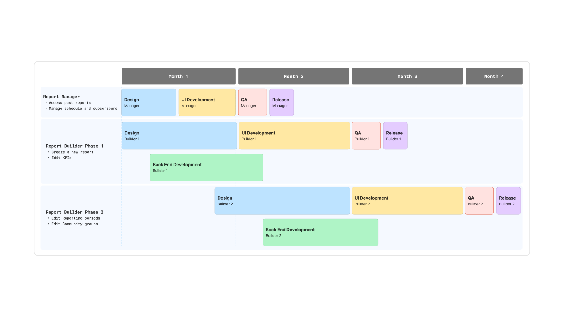
Release Strategy
We decided to release the report builder in sections to balance getting our customers more capability per their requests and engineering bandwidth.
Constraints
Engineering bandwidth - they were also working on writing integrations for new customers
Having Excel as the output limits the visuals that can be used to represent data
Our pipeline is not set up to have completely “live” data - it is currently pulled every morning
Evolution
We began exploring expanding our product to produce different outputs that can contain visuals like a dashboard, emails, and PDFs
Eng was working on rewriting our pipeline to pull the most live data from integration sources
Impact
Customers successfully built their own reports
400+ report recipients
Eng impact: Completely removed the need for the eng team’s time customizing reports, freeing up time to work on new integrations and KPIs for our product
Design impact: Added many reusable components for a more robust design system
Learnings
We needed to invest a lot of time in training on KPI education - even though the experience was simple, there were still questions about how to build impactful reports
Now that users can access their data, we need to give them more prescriptive workflows to use their data to impact business goals


